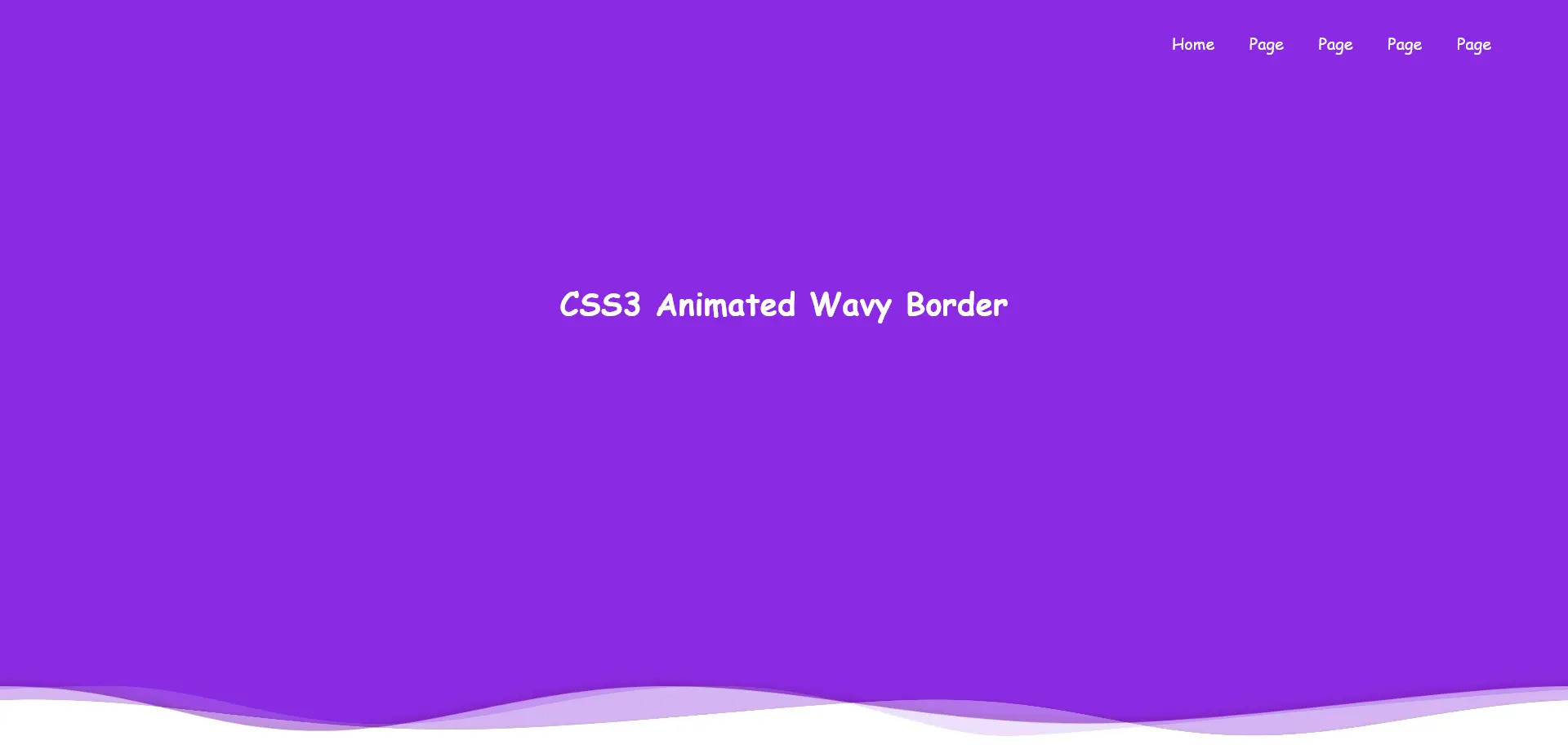
Elevate your web design with CSS3 animated wavy borders. Add a touch of elegance and dynamism to your website. Learn more on our website.

HTML Code
<div class="container">
<ul>
<li>Home</li>
<li>Page</li>
<li>Page</li>
<li>Page</li>
<li>Page</li>
</ul>
<div class="header-text">
<h2>CSS3 Animated Wavy Border</h2>
</div>
<div class="line line1">
<div class="wave wave1" style="background-image: url('https://7csslibs.com/uploads/mediafiles/l7Zf8ukISnCpZewZKmz9RAf2aJjQqpYTZAeFe8MV.png');"></div>
</div>
<div class="line line2">
<div class="wave wave2" style="background-image: url('https://7csslibs.com/uploads/mediafiles/NwotKAonYyvAjuYxG8DBWM4XxMyeEpR0Yo5Wx5g7.png');"></div>
</div>
<div class="line line3">
<div class="wave wave3" style="background-image: url('https://7csslibs.com/uploads/mediafiles/4m0Of33h1bSrj69lrVHPEcjElU8vg2irOcKwwPYS.png');"></div>
</div>
</div>
CSS Code
.container {
position: absolute;
top: 0;
bottom: 0;
left: 0;
right: 0;
margin: auto;
overflow: hidden;
}
ul{
position: absolute;
list-style: none;
right: 60px;
z-index: 99;
}
ul li{
display: inline-block;
margin: 15px;
color: white;
font-family: cursive;
}
.header-text{
position: absolute;
z-index: 99;
color: white;
top: 40%;
left: 50%;
transform: translate(-50%,-50%);
}
.header-text h2{
color: white;
font-family: cursive;
font-size: 2vw;
}
.line{
position: absolute;
width: 100%;
height: 100%;
overflow: hidden;
background-color: blueviolet;
}
.line1 {
z-index: 15;
opacity: 0.5;
}
.line2 {
z-index: 10;
opacity: 0.7;
}
.line3 {
z-index: 5;
}
.wave {
position: absolute;
left: 0;
width: 200%;
height: 100%;
background-repeat:repeat no-repeat;
background-position: 0 bottom;
transform-origin: center bottom;
}
.wave1 {
background-size: 50% 80px;
}
.wave2 {
background-size: 50% 100px;
animation: animate 12s linear infinite;
}
.wave3 {
background-size: 50% 80px;
animation: animate 18s linear infinite;
}
@keyframes animate {
0%{
transform: translateX(0) translateZ(0) scaleY(1);
}
50%{
transform: translateX(-25%) translateZ(0) scaleY(0.5);
}
100%{
transform: translateX(-50%) translateZ(0) scaleY(1);
}
}