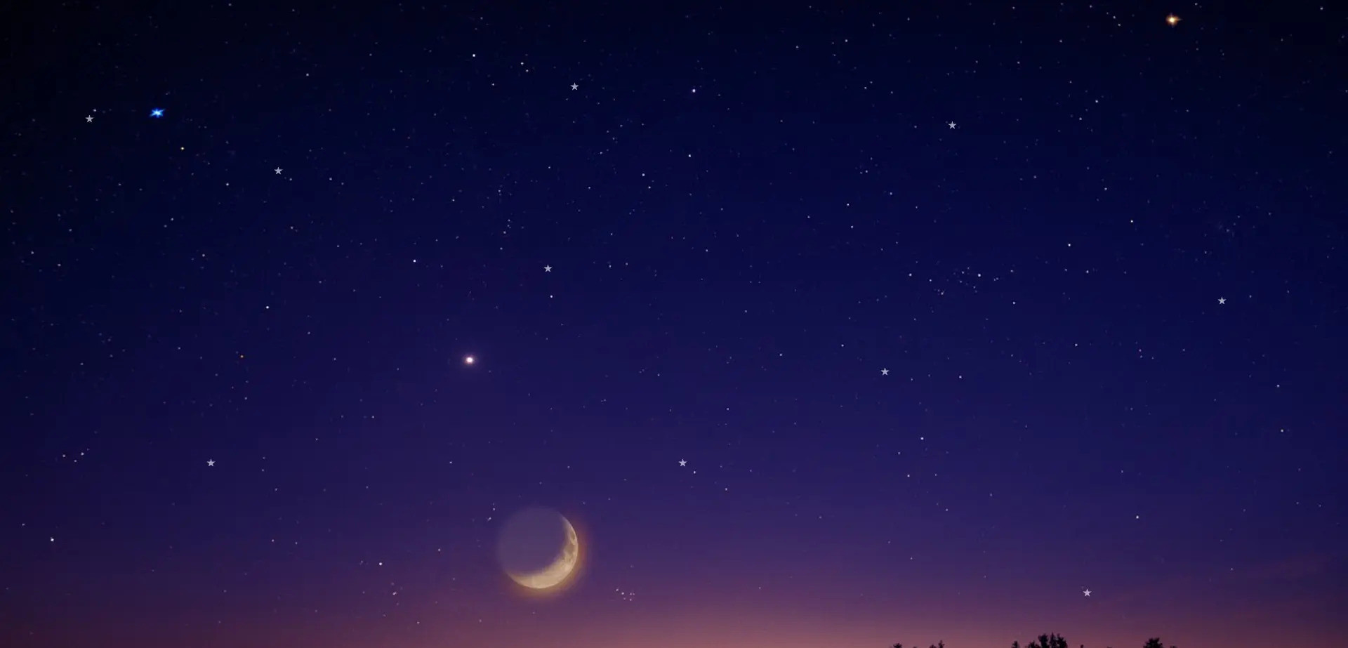
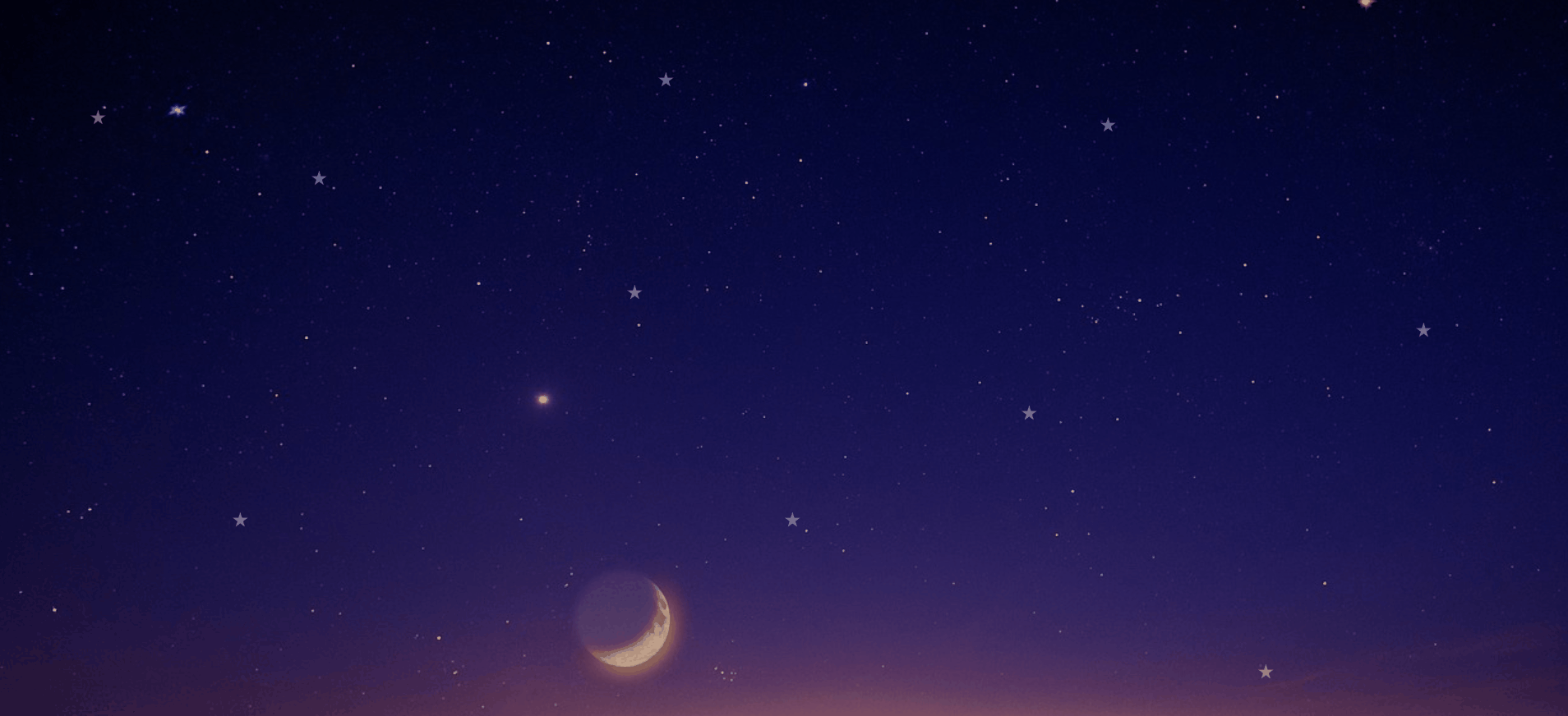
Enhance your website with stunning CSS3 glowing stars background for a captivating visual experience
HTML Code
<div class="wrapper">
<div class="item">
<div></div>
<div></div>
<div></div>
<div></div>
<div></div>
<div></div>
<div></div>
<div></div>
<div></div>
<div></div>
</div>
</div>
CSS Code
body{
margin: 0;
padding: 0;
}
.wrapper{
position: absolute;
width: 100%;
height: 100%;
overflow: hidden;
background: url('https://cdn.pixabay.com/photo/2020/04/30/20/14/sky-5114501_1280.jpg') no-repeat fixed center;
background-size: cover;
}
.item div{
position: absolute;
width: 20px;
height: 20px;
background-color: white;
clip-path: polygon(50% 0%, 61% 35%, 98% 35%, 68% 57%, 79% 91%, 50% 70%, 21% 91%, 32% 57%, 2% 35%, 39% 35%);
}
.item div:nth-child(1){
top: 12%;
left: 42%;
animation: ms 60ms linear infinite;
}
.item div:nth-child(2){
top: 70%;
left: 50%;
animation: ms 60ms linear infinite;
}
.item div:nth-child(3){
top: 17%;
left: 6%;
animation: ms 60ms linear infinite;
}
.item div:nth-child(4){
top: 18%;
left: 70%;
animation: ms 60ms linear infinite;
}
.item div:nth-child(5){
top: 90%;
left: 80%;
animation: ms 60ms linear infinite;
}
.item div:nth-child(6){
top: 25%;
left: 20%;
animation: ms 60ms linear infinite;
}
.item div:nth-child(7){
top: 40%;
left: 40%;
animation: ms 60ms linear infinite;
}
.item div:nth-child(8){
top: 70%;
left: 15%;
animation: ms 60ms linear infinite;
}
.item div:nth-child(9){
top: 56%;
left: 65%;
animation: ms 60ms linear infinite;
}
.item div:nth-child(10){
top: 45%;
left: 90%;
animation: ms 60ms linear infinite;
}
@keyframes ms {
0%{
transform: scale(0) ;
opacity: 1;
}
100%{
transform: scale(1.3) ;
opacity: 0;
}
}