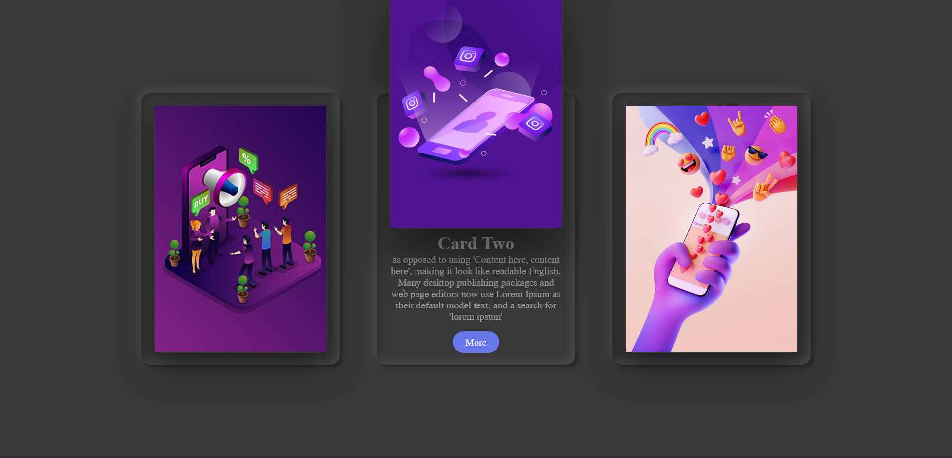
This snippet demonstrates a visually appealing way to present content using cards with a captivating image hover effect.
Built purely with CSS3, it offers a simple yet effective solution for enhancing user engagement on your website.
HTML Code
<div class="container">
<div class="card">
<div class="content">
<h3>Card One</h3>
<p> as opposed to using 'Content here, content here', making it look like readable English. Many desktop publishing packages and web page editors now use Lorem Ipsum as their default model text, and a search for 'lorem ipsum'</p>
<a href="#">More</a>
</div>
<div class="box">
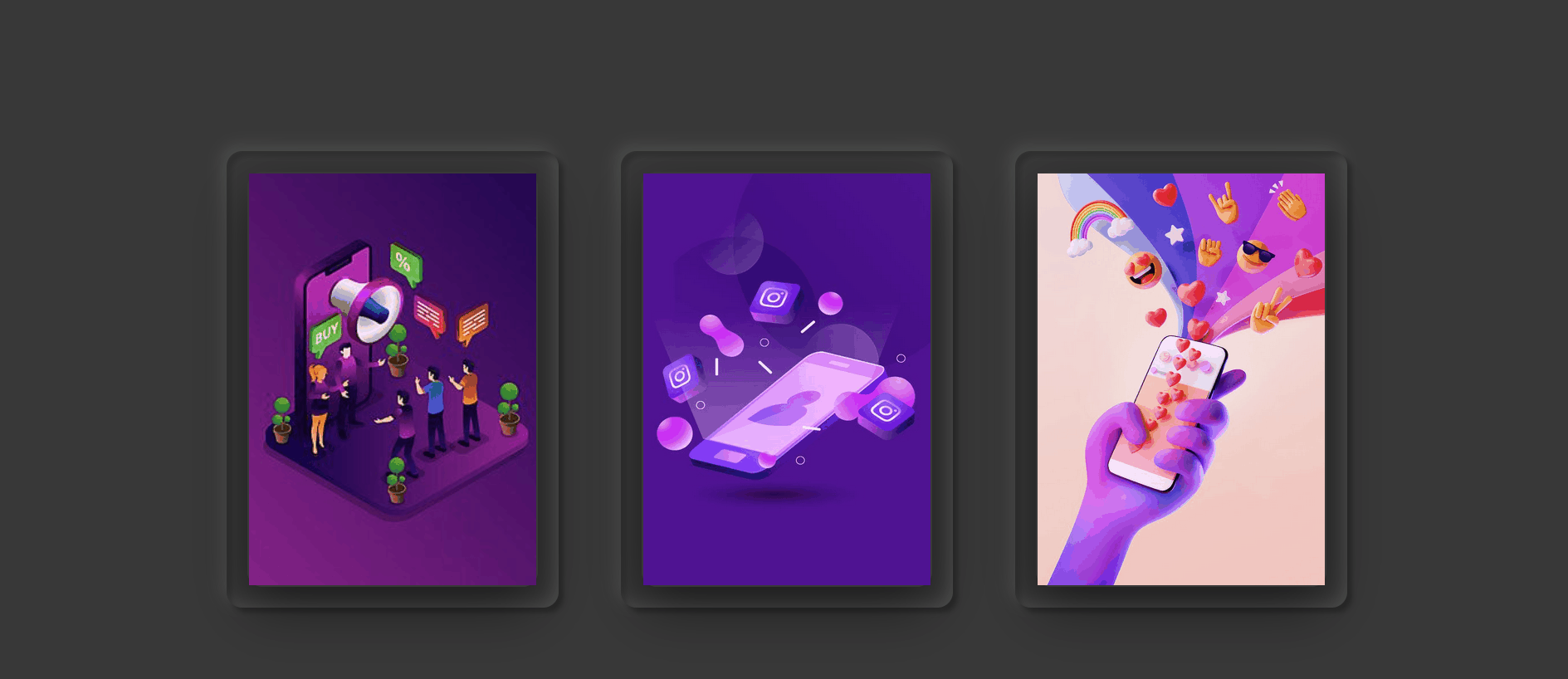
<img src="https://i.pinimg.com/564x/b6/c1/6b/b6c16bd46c66e53f3e0e8696e763e922.jpg" alt="">
</div>
</div>
<div class="card">
<div class="content">
<h3>Card Two</h3>
<p> as opposed to using 'Content here, content here', making it look like readable English. Many desktop publishing packages and web page editors now use Lorem Ipsum as their default model text, and a search for 'lorem ipsum'</p>
<a href="#">More</a>
</div>
<div class="box">
<img src="https://i.pinimg.com/736x/4d/1f/76/4d1f769ad7187a939afd371076b013f3.jpg" alt="">
</div>
</div>
<div class="card">
<div class="content">
<h3>Card Three</h3>
<p> as opposed to using 'Content here, content here', making it look like readable English. Many desktop publishing packages and web page editors now use Lorem Ipsum as their default model text, and a search for 'lorem ipsum'</p>
<a href="#">More</a>
</div>
<div class="box">
<img src="https://i.pinimg.com/736x/90/10/f3/9010f313805a5764f8941249904975b9.jpg" alt="">
</div>
</div>
</div>
CSS Code
* {
margin: 0;
padding: 0;
box-sizing: border-box;
}
body{
background-color: rgb(56, 56, 56);
}
.container {
display: flex;
height: 100vh;
justify-content: center;
align-items: center;
flex-wrap: wrap;
padding: 40px 0px;
}
.card {
position: relative;
height: 440px;
width: 320px;
box-shadow: inset 5px 5px 5px rgba(0, 0, 0, 0.2),
inset -5px -5px 15px rgba(255, 255, 255, 0.1),
5px 5px 5px rgba(0, 0, 0, 0.3),
-5px -5px 15px rgba(255, 255, 255, 0.1);
border-radius: 15px;
margin: 30px;
}
.card .box {
position: absolute;
top: 20px;
left: 20px;
bottom: 20px;
right: 20px;
background:rgb(56, 56, 56) ;
border: 2px solid rgb(56, 56, 56);
border-radius: 15px;
box-shadow: 0 20px 50px rgba(0, 0, 0, 0.5);
transition: 0.5s;
display: flex;
justify-content: center;
align-items: center;
}
.card:hover .box {
transform: translateY(-50%);
box-shadow: 0 40px 70px rgba(0, 0, 0, 0.5);
}
.card .box img {
width: 100%;
height: 100%;
object-fit: cover;
}
.card .content {
position: absolute;
bottom: 0;
padding: 20px;
text-align: center;
}
.card .content h3 {
color: rgba(255, 255, 255, 0.5);
font-size: 1.8em;
z-index: 1;
transition: 0.5s;
}
.card .content p {
color: rgba(255, 255, 255, 0.5);
font-size: 1em;
z-index: 1;
transition: 0.5s;
}
.card .content a {
position: relative;
display: inline-block;
margin-top: 15px;
padding: 8px 20px;
margin-top: 15px;
background-color: black;
border-radius: 20px;
text-decoration: none;
color: white;
}
.card:nth-child(1) .content a {
background-color: rgb(204, 21, 21);
}
.card:nth-child(2) .content a {
background-color: rgb(105, 121, 235);
}
.card:nth-child(3) .content a {
background-color: rgb(204, 164, 21);
}