A piece of code that creates a visually appealing card element with a glowing,
gradient border. It leverages the capabilities of CSS3 to achieve this effect without requiring additional images or plugins
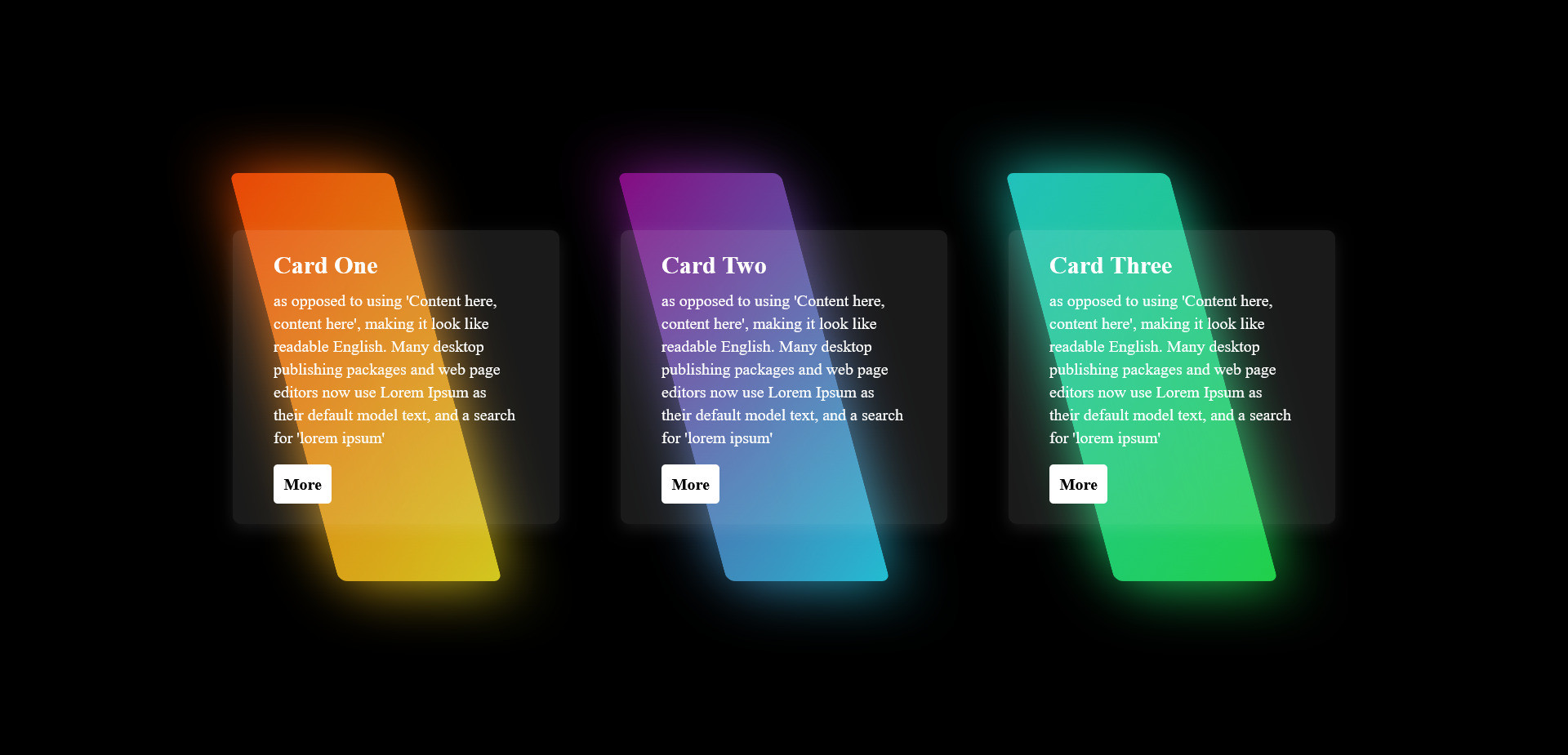
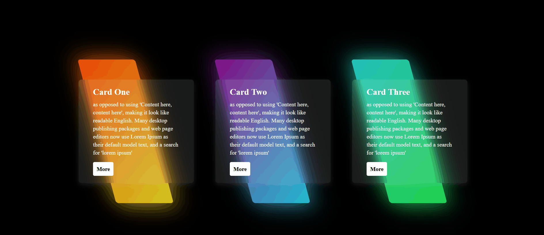
HTML Code
<div class="container">
<div class="card">
<span></span>
<div class="content">
<h2>Card One</h2>
<p> as opposed to using 'Content here, content here', making it look like readable English. Many desktop publishing packages and web page editors now use Lorem Ipsum as their default model text, and a search for 'lorem ipsum'</p>
<a href="#">More</a>
</div>
</div>
<div class="card">
<span></span>
<div class="content">
<h2>Card Two</h2>
<p> as opposed to using 'Content here, content here', making it look like readable English. Many desktop publishing packages and web page editors now use Lorem Ipsum as their default model text, and a search for 'lorem ipsum'</p>
<a href="#">More</a>
</div>
</div>
<div class="card">
<span></span>
<div class="content">
<h2>Card Three</h2>
<p> as opposed to using 'Content here, content here', making it look like readable English. Many desktop publishing packages and web page editors now use Lorem Ipsum as their default model text, and a search for 'lorem ipsum'</p>
<a href="#">More</a>
</div>
</div>
</div>
CSS Code
* {
margin: 0;
padding: 0;
box-sizing: border-box;
}
body{
background-color: black;
}
.container {
display: flex;
height: 100vh;
justify-content: center;
align-items: center;
flex-wrap: wrap;
padding: 40px 0px;
}
.card {
position: relative;
width: 320px;
height: 400px;
display: flex;
justify-content: center;
align-items: center;
margin: 40px 30px;
transition: 0.5s;
}
.card::before {
content: '';
position: absolute;
left: 50px;
width: 50%;
height: 100%;
background: white;
border-radius: 8px;
transform: skewX(15deg);
transition: 0.5s;
}
.card::after {
content: '';
position: absolute;
left: 50px;
width: 50%;
height: 100%;
background: white;
border-radius: 8px;
transform: skewX(15deg);
transition: 0.5s;
filter: blur(30px);
}
.card:hover::before,
.card:hover::after {
transform: skewX(0deg);
left: 20px;
width: calc(100% - 90px);
}
.card:nth-child(1)::before,
.card:nth-child(1)::after{
background: linear-gradient(315deg, rgb(209, 203, 32), rgb(233, 66, 5));
}
.card:nth-child(2)::before,
.card:nth-child(2)::after{
background: linear-gradient(315deg, rgb(31, 194, 212), rgb(137, 5, 129));
}
.card:nth-child(3)::before,
.card:nth-child(3)::after{
background: linear-gradient(315deg, rgb(32, 209, 70), rgb(33, 192, 192));
}
.card span {
display: block;
position: absolute;
top: 0;
left: 0;
right: 0;
bottom: 0;
z-index: 50;
pointer-events: none;
}
.card span::before {
content: '';
position: absolute;
top: 0;
left: 0;
width: 100%;
height: 100%;
border-radius: 8px;
background: rgba(255, 255, 255, 0.1);
backdrop-filter: blur(10px);
opacity: 0;
transition: 0.5s;
animation: animate 3s ease-in-out infinite;
}
.card:hover span::before {
top: -50px;
left: 50px;
width: 100px;
height: 100px;
opacity: 1;
}
.card span::after {
content: '';
position: absolute;
bottom: 0;
right: 0;
width: 100%;
height: 100%;
border-radius: 8px;
background: rgba(255, 255, 255, 0.1);
backdrop-filter: blur(10px);
opacity: 0;
transition: 0.5s;
animation: animate 3s ease-in-out infinite;
}
.card:hover span::after {
bottom: -50px;
right: 50px;
width: 100px;
height: 100px;
opacity: 1;
}
.card .content {
position: relative;
padding: 20px 40px;
background: rgba(255, 255, 255, 0.1);
box-shadow: 0 5px 15px rgba(255, 255, 255, 0.1);
border-radius: 8px;
backdrop-filter: blur(10px);
color: white;
z-index: 1;
transition: 0.5s;
}
.card:hover .content {
left: -25px;
padding: 60px 40px;
}
.card .content h2 {
margin-bottom: 10px;
}
.card .content p {
margin-bottom: 10px;
line-height: 1.4em;
}
.card .content a {
display: inline-block;
color: black;
background-color: white;
border-radius: 4px;
text-decoration: none;
padding: 10px;
font-weight: 700;
margin-top: 5px;
}
@keyframes animate {
0%, 100% {
transform: translateY(10px);
}
50% {
transform: translateY(-10px);
}
}