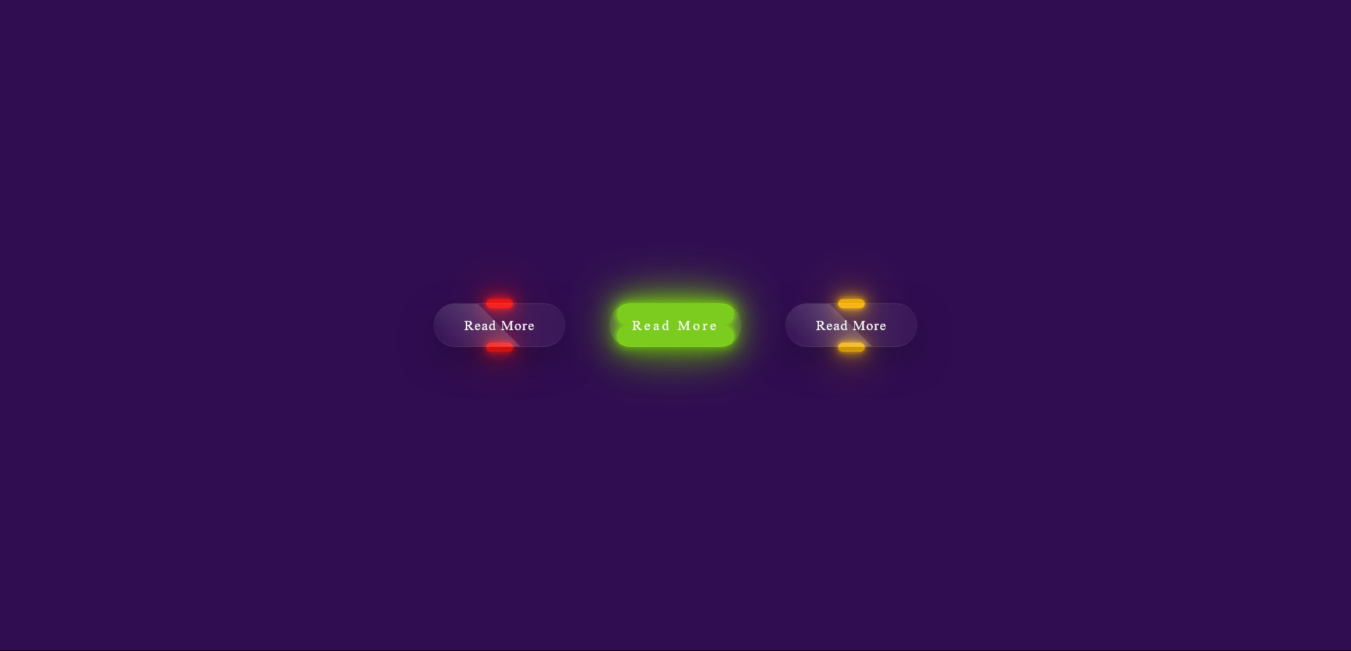
a piece of code that creates a visually appealing hover effect for buttons on your website.
It simulates a frosted glass look, adding a modern and stylish touch to your design

HTML Code
<div class="btn-container">
<div class="btn"><a href="#">Read More</a></div>
<div class="btn"><a href="#">Read More</a></div>
<div class="btn"><a href="#">Read More</a></div>
</div>
CSS Code
* {
margin: 0;
padding: 0;
box-sizing: border-box;
}
body {
background-color: rgb(48, 13, 80);
display: flex;
height: 100vh;
justify-content: center;
align-items: center;
}
.btn-container {
width: 600px;
display: flex;
flex-wrap: wrap;
justify-content: space-around;
}
.btn-container .btn {
position: relative;
width: 150px;
height: 50px;
margin: 20px;
}
.btn-container .btn a {
position: absolute;
top: 0;
left: 0;
width: 100%;
height: 100%;
display: flex;
justify-content: center;
align-items: center;
background: rgba(255, 255, 255, 0.05);
box-shadow: 0 15px 35px rgba(0, 0, 0, 0.2);
border-top: 1px solid rgba(255, 255, 255, 0.1);
border-bottom: 1px solid rgba(255, 255, 255, 0.1);
border-radius: 30px;
color: white;
z-index: 1;
letter-spacing: 1px;
font-weight: 400;
text-decoration: none;
overflow: hidden;
transition: 0.5s;
backdrop-filter: blur(10px);
}
.btn-container .btn:hover a {
letter-spacing: 3px;
}
.btn-container .btn a::before {
content: '';
position: absolute;
top: 0;
left: 0;
width: 50%;
height: 100%;
background: linear-gradient(to left, rgba(255,255,255,0.15), transparent);
transform: skewX(45deg) translateX(0);
transition: 0.5s;
}
.btn-container .btn:hover a::before {
transform: translateX(200%);
}
.btn-container .btn::before {
content: '';
position: absolute;
left: 50%;
bottom: -5px;
transform: translateX(-50%);
width: 30px;
height: 10px;
border-radius: 10px;
transition: 0.5s;
}
.btn-container .btn:hover::before {
bottom: 0;
height: 50%;
width: 90%;
border-radius: 30px;
transition-delay: 0.3s;
}
.btn-container .btn::after {
content: '';
position: absolute;
left: 50%;
top: -5px;
transform: translateX(-50%);
width: 30px;
height: 10px;
border-radius: 10px;
transition: 0.5s;
}
.btn-container .btn:hover::after {
top: 0;
height: 50%;
width: 90%;
border-radius: 30px;
transition-delay: 0.3s;
}
.btn-container .btn:nth-child(1)::before,
.btn-container .btn:nth-child(1)::after {
background-color: rgb(242, 22, 22);
box-shadow: 0 0 5px rgb(242, 22, 22), 0 0 15px rgb(242, 22, 22), 0 0 30px rgb(242, 22, 22), 0 0 60px rgb(242, 22, 22);
}
.btn-container .btn:nth-child(2)::before,
.btn-container .btn:nth-child(2)::after {
background-color: rgb(116, 201, 18);
box-shadow: 0 0 5px rgb(116, 201, 18), 0 0 15px rgb(116, 201, 18), 0 0 30px rgb(116, 201, 18), 0 0 60px rgb(116, 201, 18);
}
.btn-container .btn:nth-child(3)::before,
.btn-container .btn:nth-child(3)::after {
background-color: rgb(244, 177, 9);
box-shadow: 0 0 5px rgb(244, 177, 9), 0 0 15px rgb(244, 177, 9), 0 0 30px rgb(244, 177, 9), 0 0 60px rgb(244, 177, 9);
}