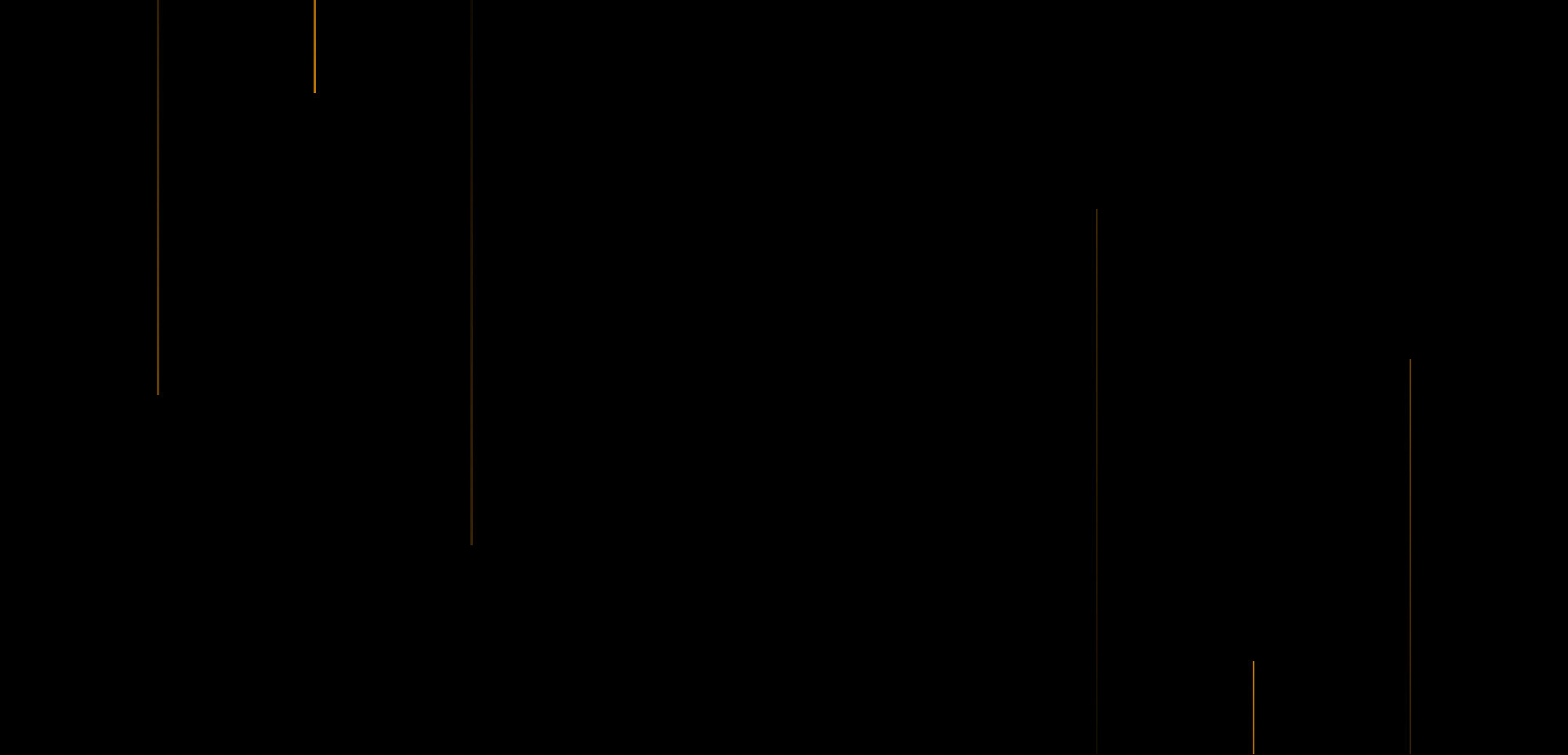
Creates a dynamic and visually interesting background effect using CSS3 animations.
This snippet utilizes CSS3's keyframes functionality to animate lines on your webpage's background.

HTML Code
<div class="lines">
<span></span>
<span></span>
<span></span>
<span></span>
<span></span>
<span></span>
</div>
CSS Code
* {
padding: 0;
margin: 0;
box-sizing: border-box;
}
body {
background-color: black;
}
.lines {
position: absolute;
width: 100%;
height: 100vh;
overflow: hidden;
}
.lines span:nth-child(1) {
position: absolute;
top: -100%;
left: 10%;
background: linear-gradient(180deg, transparent, rgb(206, 131, 11));
width: 2px;
height: 100%;
animation: animate1 5s linear infinite;
}
.lines span:nth-child(2) {
position: absolute;
bottom: -100%;
right:10%;
background: linear-gradient(360deg, transparent, rgb(206, 131, 11));
width: 2px;
height: 100%;
animation: animate2 5s linear infinite;
}
.lines span:nth-child(3) {
position: absolute;
top: -100%;
left: 20%;
background: linear-gradient(180deg, transparent, rgb(206, 131, 11));
width: 2px;
height: 100%;
animation: animate1 5s linear infinite;
animation-delay: 2s;
}
.lines span:nth-child(4) {
position: absolute;
bottom: -100%;
right:20%;
background: linear-gradient(360deg, transparent, rgb(206, 131, 11));
width: 2px;
height: 100%;
animation: animate2 5s linear infinite;
animation-delay: 2s;
}
.lines span:nth-child(5) {
position: absolute;
top: -100%;
left: 30%;
background: linear-gradient(180deg, transparent, rgb(206, 131, 11));
width: 2px;
height: 100%;
animation: animate1 5s linear infinite;
animation-delay: 4s;
}
.lines span:nth-child(6) {
position: absolute;
bottom: -100%;
right:30%;
background: linear-gradient(360deg, transparent, rgb(206, 131, 11));
width: 2px;
height: 100%;
animation: animate2 5s linear infinite;
animation-delay: 4s;
}
@keyframes animate1 {
0% {
top: -100%;
opacity: 1;
}
100% {
top: 0;
opacity: 0;
}
}
@keyframes animate2 {
0% {
bottom: -100%;
opacity: 1;
}
100% {
bottom: 0;
opacity: 0;
}
}