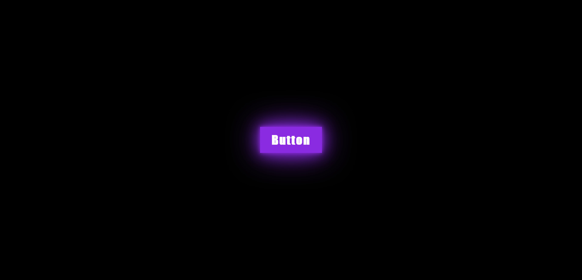
A piece of code that creates a visual effect where a button appears to glow when you hover your mouse over it.
This is achieved using various CSS3 properties like box-shadow, blur, and transition. The effect can enhance the look and interactivity of your website's buttons, making them more visually appealing and engaging for users

HTML Code
<a href="#" class="glowing-btn">
<span></span>
<span></span>
<span></span>
<span></span>
Button
</a>
CSS Code
* {
padding: 0;
margin: 0;
box-sizing: border-box;
}
body {
background-color: black;
display: flex;
justify-content: center;
align-items: center;
height: 100vh;
}
.glowing-btn {
position: relative;
display: inline-block;
color: blueviolet;
font-family: Impact, Haettenschweiler, 'Arial Narrow Bold', sans-serif;
font-weight: bold;
font-size: 2em;
text-decoration: none;
padding: 15px 30px;
letter-spacing: 2px;
transition: 0.2s;
transition-delay: 1s;
overflow: hidden;
}
.glowing-btn:hover {
color: white;
background-color: blueviolet;
box-shadow: 0 0 10px blueviolet, 0 0 40px blueviolet, 0 0 80px blueviolet;
}
.glowing-btn span {
position: absolute;
display: block;
}
.glowing-btn span:nth-child(1) {
top: 0;
left: -100%;
width: 100%;
height: 2px;
background: linear-gradient(90deg, transparent, blueviolet);
transition: 1s;
}
.glowing-btn:hover span:nth-child(1) {
left: 100%;
}
.glowing-btn span:nth-child(3) {
bottom: 0;
right: -100%;
width: 100%;
height: 2px;
background: linear-gradient(270deg, transparent, blueviolet);
transition: 1s;
}
.glowing-btn:hover span:nth-child(3) {
right: 100%;
transition-delay: 0.5s;
}
.glowing-btn span:nth-child(2) {
top: -100%;
right: 0;
width: 2px;
height: 100%;
background: linear-gradient(180deg, transparent, blueviolet);
transition: 1s;
}
.glowing-btn:hover span:nth-child(2) {
top: 100%;
transition-delay: 0.25s;
}
.glowing-btn span:nth-child(4) {
bottom: -100%;
left: 0;
width: 2px;
height: 100%;
background: linear-gradient(360deg, transparent, blueviolet);
transition: 1s;
}
.glowing-btn:hover span:nth-child(4) {
bottom: 100%;
transition-delay: 0.75s;
}